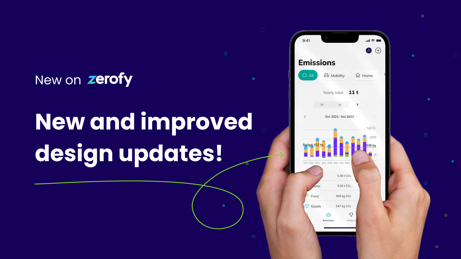
At Zerofy, we’re very proud of the constant improvements our team has been making to the app! In our mission to help households decarbonise, we endeavor to build the best and most user-friendly product. A recent update to the app includes some fantastic design refinements and a new look for a cornerstone of the product: emissions tracking. Read below for more details and some insight into our design decisions and vision.
Zerofy App Design Updates
Simplified header
By simplifying the header from a dark color to a minimalistic gray, we aimed to turn our users’ attention towards what matters most, their household emissions.
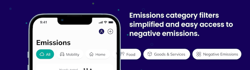
New design for emissions category filters
One of the key factors in understanding your household emission is having not only an overview by time period, but being able to fully understand the impact of each category on your overall carbon footprint. In past designs of our app, this navigation was a bit less intuitive. For the recent release, we decided to move from a menu to a filter, aiming to give our users an easier flow of their information. We also think this makes the content more accessible, including adding negative emissions to the overview.
Emissions totals and display by year, month, & week
Just as people might evaluate their finances by looking at spending over different time periods, our users can dive into their emissions over year, month, and week to understand their carbon footprint. We believe viewing emissions over different durations provides people with a way to access more insight and then make improvements.
-
Weekly (last 7 days): A week is a great short-term waypoint to check in and get more detailed information about your current emissions behavior. This gives users an opportunity to make quick changes based on their most recent activity.
-
Monthly (last 30 days) and yearly (last 12 months) are helpful for some users who like to think of their emissions over longer periods. These are key periods to gain long term understanding over your emissions. Think about data like how much you use your car in a month, how much you travel in a year, or how your energy consumption varies seasonally. It also allows you to recognise progress, outline long-term actions you can take, and remove the carbon from a specific period you could not reduce (i.e. through purchasing permanent carbon removal).
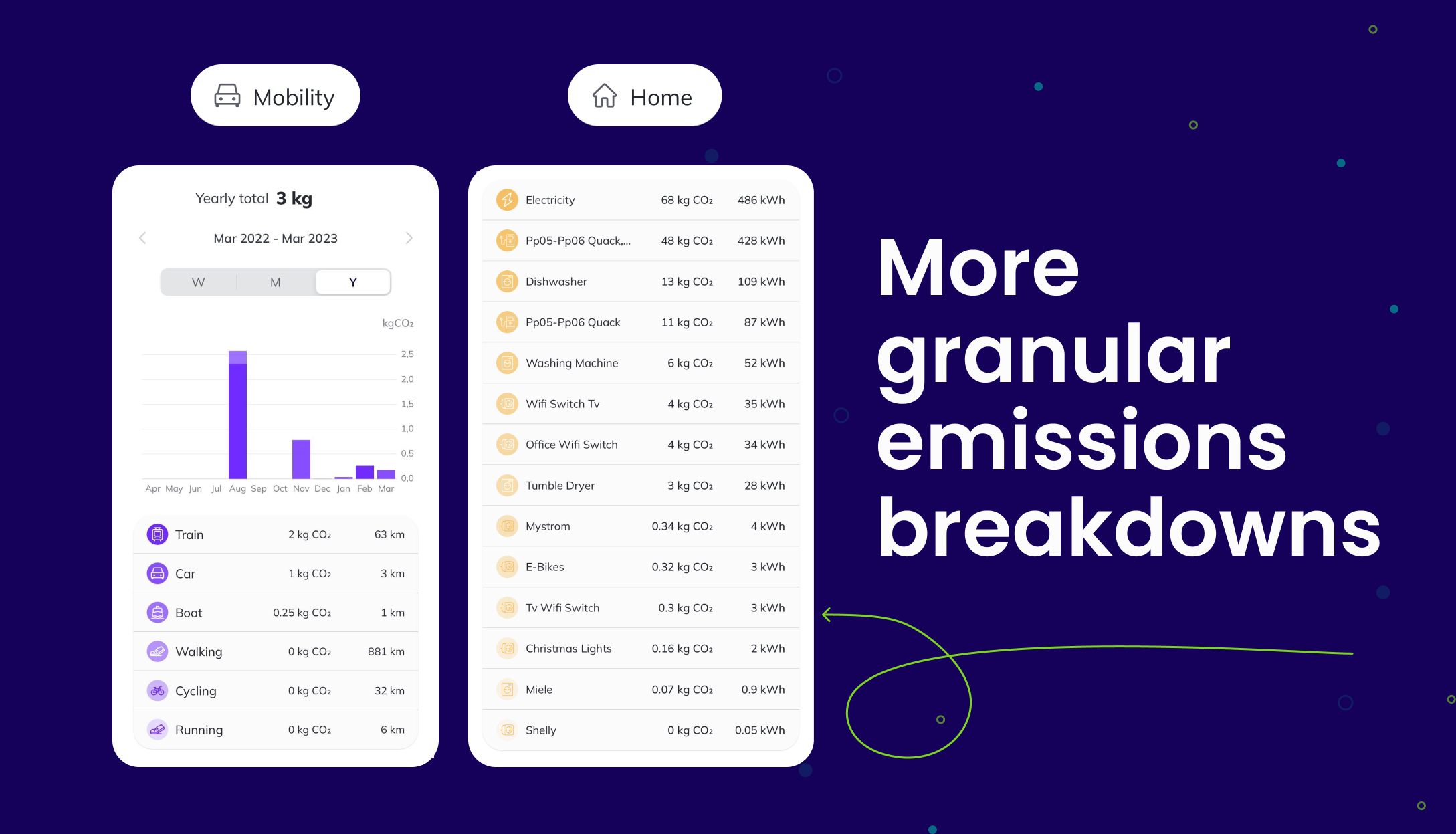
More granular emissions breakdown into sub categories & emissions and energy use in kWh by device
-
To take meaningful action, it is key to understand what activities have the highest impact on your emissions. To this end, we’ve implemented the breakdowns into the category screens. Visualisation is a great tool to increase comprehension and motivate users to take action.
-
For example, on mobility emissions, you can compare emissions versus kilometers traveled. If you notice that you are traveling short distances (km) and always use your car, that can motivate you to address the behavior by biking or walking. On the contrary, if you see high kilometers and zero emissions because you’ve been getting around walking and cycling, you’ll feel motivated to continue keeping your emissions low.
-
Another example: on energy emissions, if you connect your smart meter or enter your kWh values (from your bill or your energy meter) and connect smart devices (a smart plug with your TV, your Miele dryer etc), you can clearly see the total consumption, plus consumption by each device. That’s very powerful and precise insight into your use and associated emissions, allowing you to take effective actions to reduce, plus save money on energy bills.
Start tracking and reducing emissions!